Your cart is currently empty!
Effective wayfinding signage helps create user friendly environments.
Situations where a workplace or other facility receives large numbers of people who may not know where they are going, demands an efficent system for directing traffic – signage is a crucial part of this system.
Good wayfinding signage reduces stress, improves user satisfaction and increases safety. it is well worth the investment to develop a successful wayfinding system.
There are 4 main components to any wayfinding signage package.
Compliance Signage
Regulatory signage is typically defined for us – it is about providing minimum standards of safety and support that should be available in all built environments.
Compliance signage is typically focussed on clear messaging and minimising risk and liability for all. Danger signs, access controls, basic toilet signage, fire and other hazard related signs are examples of the sorts of signage that must not be forgotten in the rush to provide an overall wayfinding package.
Identification Signage
We need to let people know where they are! Another basic wayfinding requirement – don’t get caught up trying to guide people to other destinations – they need to have a defined starting point ie Where Am I? Have I Arrived?
As with all signage, don’t lose the message by trying to be too clever. Simple signage works the best.
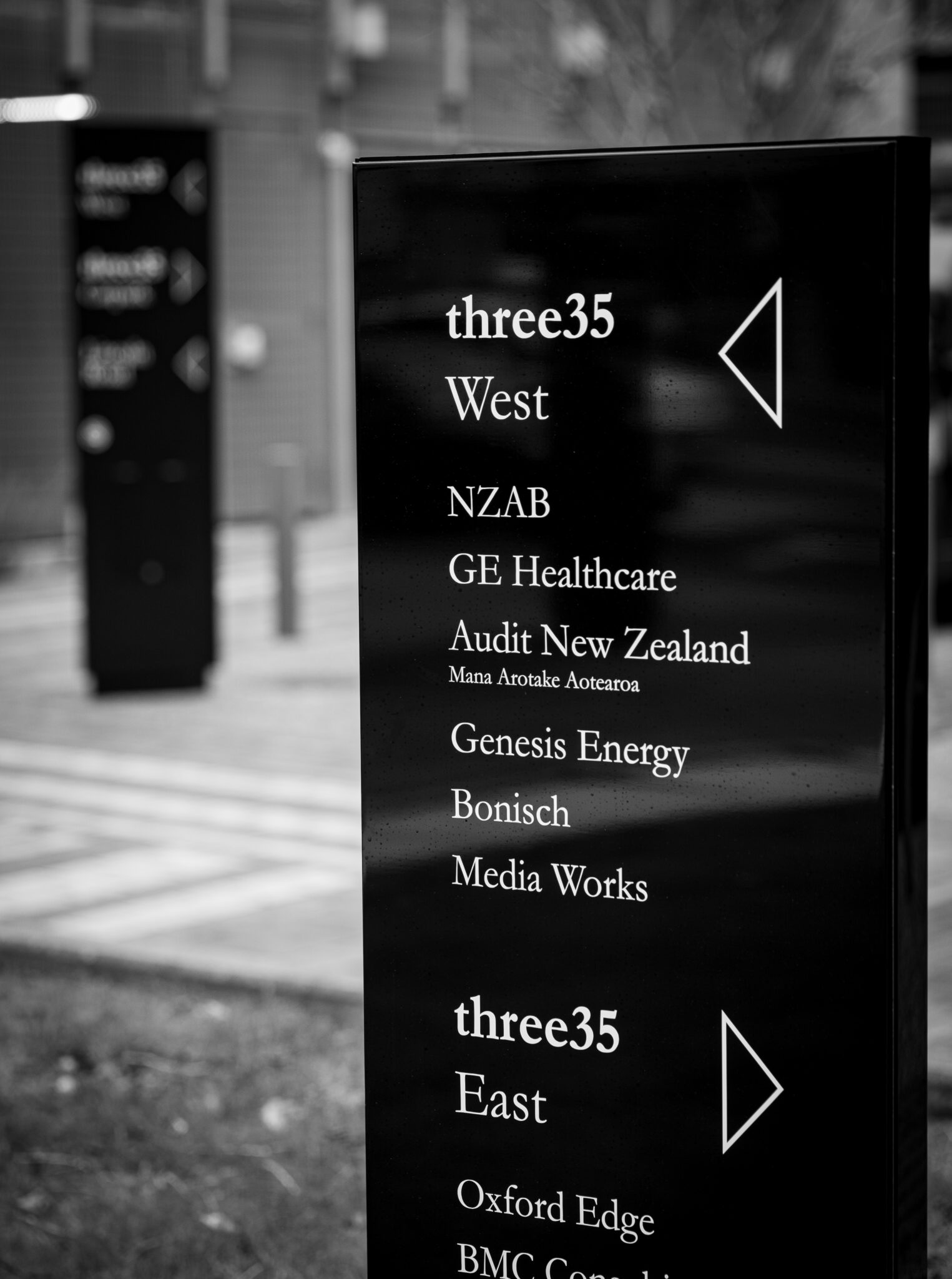
Directional Signage
This is where you really need to take your time. Yes, design is important – an attractive directional system can make a massive difference to the overall feel and presence of an environment – but will be quickly forgotten if people keep getting lost!
The less physically defined and limited an area, the more you need directional signage to help people get where they need to go, without getting lost along the way. Junctions, open spaces, building approaches all need directional signage to quickly capture the attention of the user and begin the process of funneling them to their destination.
For existing builds, always talk to the users – they know what confuses people, where issues arise and what locations are generating all the questions.

Informational Signs
These are signs that provide a broader picture of the facility – not so much where am I – more What Are My Options!
Effective use of symbols, colour-coding and keys can be crucial – keep it simple and consistent and you will go a long way toward a signage foundation that can then be easily built out across the environment.
Informational signage also covers off aspects like available services, operating hours and other amenities.
Other Considerations
- Durability – people love to pick and poke at signs – you don’t want crucial messaging disappearing
- Updates – things change – your wayfinding system needs to allow for future signage updates
- Consistency is key – an integrated solution helps people quickly understand how the signage works allowing for effective utilisation across the whole facility. Inconsistent signage leads to a loss of credibility and user confidence


